多选框
- 更新时间:2026-06-15 07:53:03
多选框-check
原生类型:{com.google.android.material.checkbox.MaterialCheckBox}
多选框控件{XCheck}是属于{XView}的子控件,因此{XView}中的所有方法,多选框控件都可以调用。
多选框一般用于:用户同意、配置多种选择、筛选数据等场景。
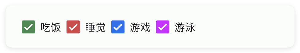
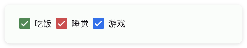
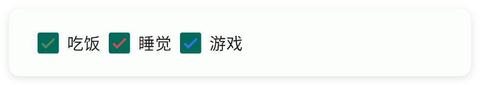
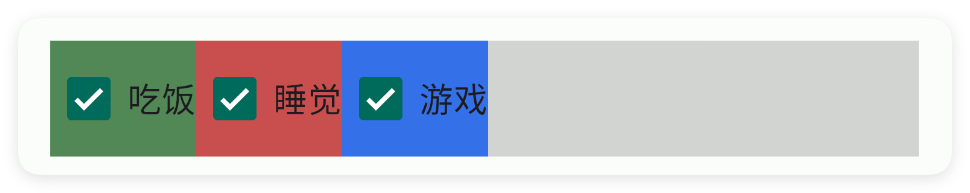
一、基础用法
二、常用属性
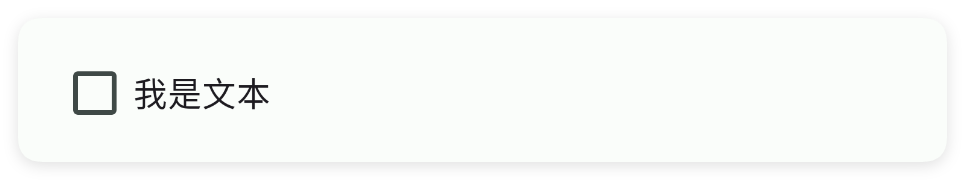
text - 文本
设置文本
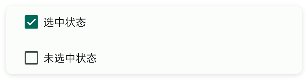
check - 选中
设置选中
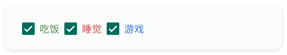
color - 主题颜色
设置主题颜色
tint - 按钮颜色
设置按钮颜色
textColor - 文本颜色
设置文本颜色
minW - 最小宽度
设置最小宽度
单位:dp
minH - 最小高度
设置最小高度
单位:dp
padding - 内边距
设置内边距
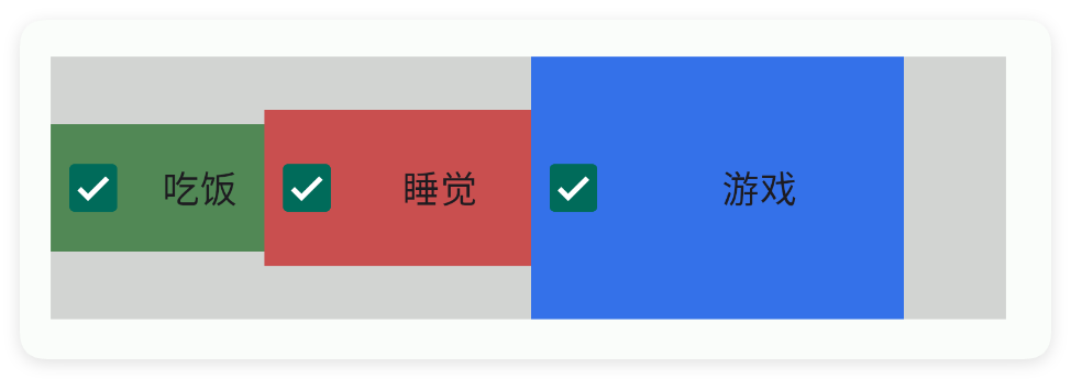
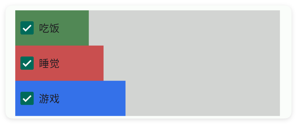
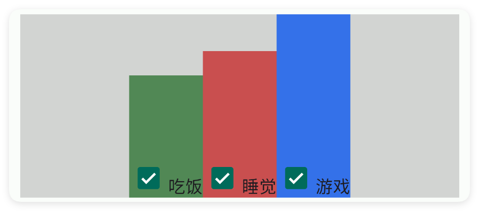
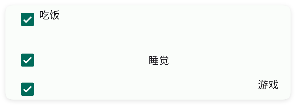
gravity - 重力
设置重力
bg - 背景颜色
设置背景颜色
bgImg - 背景图片
设置背景图片

storeKey - 存储布尔值
存储布尔值
通过storeKey(存储关键字)指定一个存储布尔值的关键字,获取值时可以直接通过$storage($存储)获取布尔值。
注意:不同的控件存储的类型不同,对于本控件(复选框)则存储的是布尔值类型,表达当前是否被勾选
如果我们已经配置好了应用内存储,则可以直接获取数据:
注意:一、要使用应用内存储,必须在ui(界面)节点指定属性store(存储)的值,该值指定存储的命名空间; 二、不是所有的控件都支持应用内存储; 三、不同的控件存储的数据类型可能都不一致,例如:输入类型的控件存储的是字符串类型,开关、多选框存储的就是布尔类型的数据。
三、常用函数
onCheck(callback)
设置选中监听
当选中状态改变时,会回调该函数
注意在1.5.9版本之后,该函数回调的参数顺序为(isChecked,view),之前的版本是(view,isChecked)
- 参数 : callback {(isChecked,view)=>{}} 选中监听
isChecked()
判断是否选中
- 返回 : {boolean} true:选中,false:没有选中
check(checked)
设置选中的状态
- 参数 : checked {boolean} true:选中,false:没有选中
setGravity(gravity)
设置控件的对齐方式
- 参数 : gravity {String} 例如:"center|bottom"
setText(text)
设置文字
- 参数 : text {String} 文字
getText()
获得文字
如果获取的文本为null则返回空字符串
- 返回 : {String} 文字
setColor(color)
设置主题颜色
- 参数 : color {String} 颜色
setColor(color)
设置主题颜色
- 参数 : color {int} 颜色
setTextColor(color)
设置文字颜色
- 参数 : color {String} 颜色
setTextColor(color)
设置文字颜色
- 参数 : color {int} 颜色
setBg(color)
设置背景颜色
- 参数 : color {String} 颜色
setBg(color)
设置背景颜色
- 参数 : color {int} 颜色