单选按钮
- 更新时间:2026-06-15 07:53:04
单选按钮-radio
原生类型:{com.google.android.material.radiobutton.MaterialRadioButton}
单选按钮:一般需要配合单选按钮组(radio-group)的配合才能实现互相排斥的效果,这个控件常用在只需要在多个选择中选择一个的情况。

一、常用属性
color - 主题颜色
设置主题颜色
check - 选中状态
设置选中状态

text - 文本
设置文本

textColor - 文本颜色
设置文本颜色

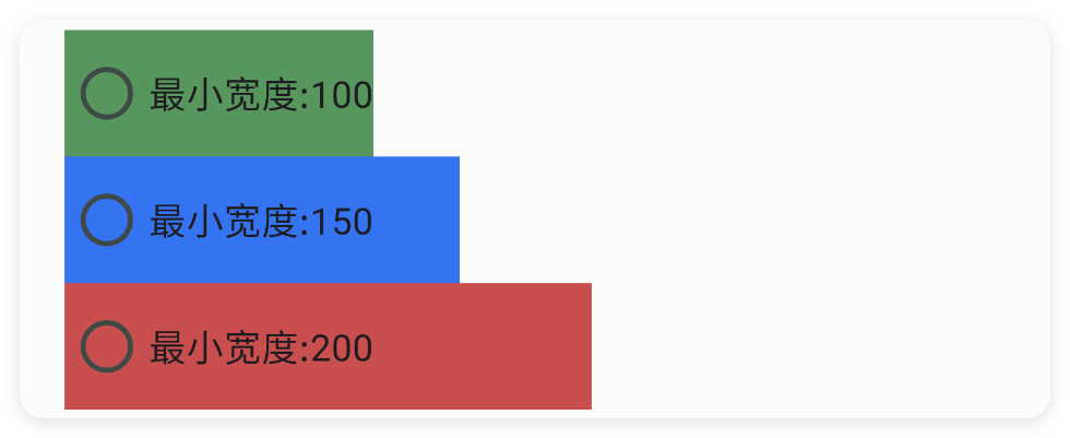
minW - 最小宽度
设置最小宽度
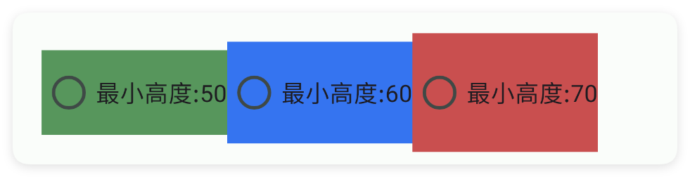
minH - 最小高度
设置最小高度
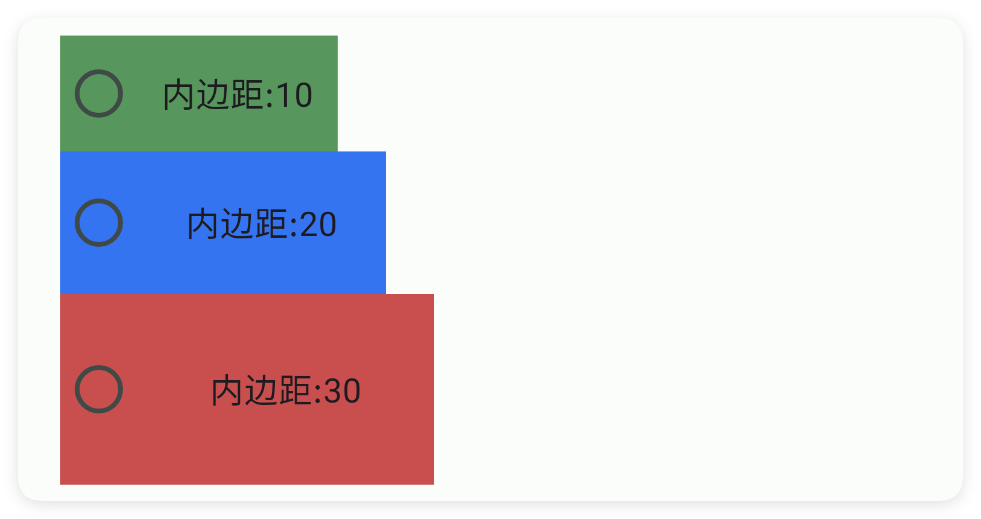
padding - 内边距
设置内边距
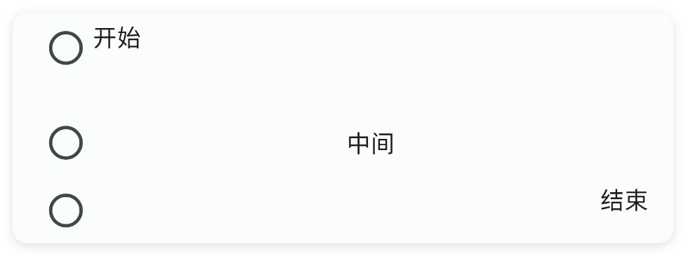
gravity - 重力
设置重力
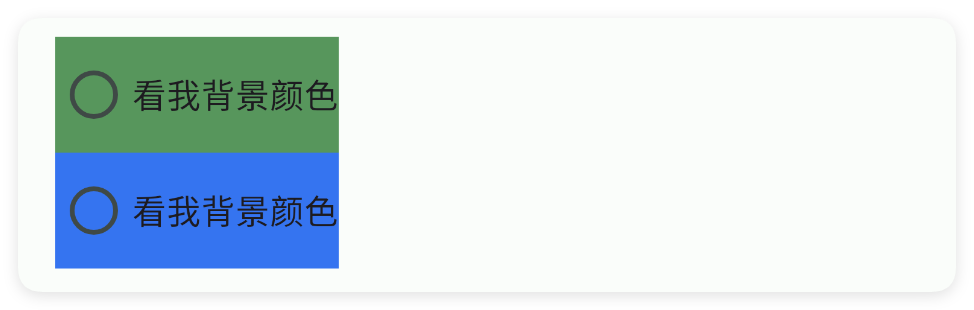
bg - 背景颜色
设置背景颜色
bgImg - 背景图片
设置背景图片

storeKey - 存储布尔值
存储布尔值
通过storeKey(存储关键字)指定一个存储布尔值的关键字,获取值时可以直接通过$storage($存储)获取布尔值。
注意:不同的控件存储的类型不同,对于本控件(开关)则存储的是布尔值类型,表达当前是否被选中
如果我们已经配置好了应用内存储,则可以直接获取数据:
注意:一、要使用应用内存储,必须在ui(界面)节点指定属性store(存储)的值,该值指定存储的命名空间; 二、不是所有的控件都支持应用内存储; 三、不同的控件存储的数据类型可能都不一致,例如:输入类型的控件存储的是字符串类型,开关、多选框存储的就是布尔类型的数据。
二、常用函数
isChecked()
判断选中状态
- 返回 : {boolean} 是否选中了
- 版本 : 1.8.2
check(checked)
设置选中状态
- 参数 : checked {boolean} 是否选中
onCheck(callback)
设置选中状态回调事件
- 参数 : callback {(isChecked)=>{}} 回调事件
setGravity(gravity)
设置控件的对齐方式
- 参数 : gravity {String} 例如:"center|bottom"
setText(text)
设置文字
- 参数 : text {String} 文字
getText()
获得文字
- 返回 : {String} 文字
setColor(color)
设置主题颜色
- 参数 : color {String} 颜色
setTextColor(color)
设置文字颜色
- 参数 : color {String} 颜色